


15673 In-game now on Steam

Lose the Thumb: Creating Left 4 Dead's Box Art
April 9, 2009 - Jeremy Bennett
Hello. My name is Jeremy Bennett, and I'm an artist at Valve. Most gamers only ever get to see the finished product of a game cover, so we thought some of you might find it interesting to hear the process that led to Left 4 Dead's final art. As you'll see, there were quite a few attempts along the way, all of them eventually abandoned.
Our first designs focused on Bill, Louis, Francis and Zoey, the four lead characters that players would be guiding through Left 4 Dead's post-apocalyptic zombie wasteland. Right away this presented problems.
Typically, for a video game (or DVD or book) cover to be eye-catching, there'll be a single prominent element front and center—our "hero" character, for example, with ancillary characters standing around in the background:
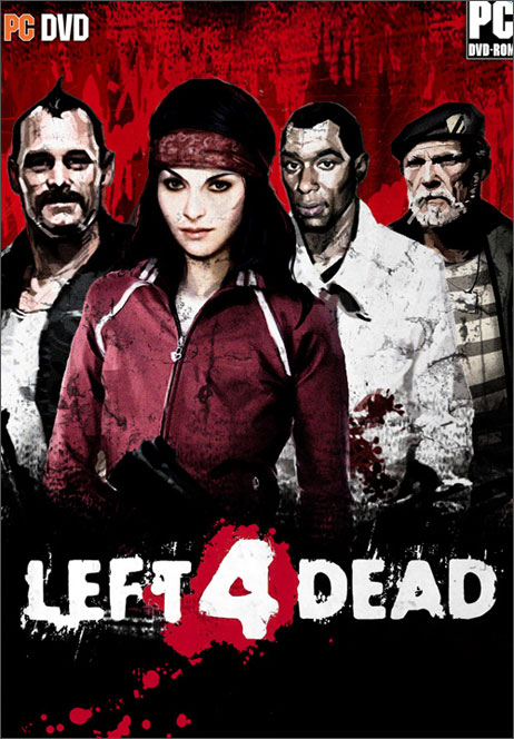
As a multiplayer game with an emphasis on teamwork, though, Left 4 Dead didn't really have a central character. Pretending otherwise, we decided, was just misleading—if the box art is selling a different game than the one in the box, it's not doing its job.
So a lead character filling up the front of a game box was out. Next we tried spacing the four characters out at equal size. On the plus side, this avoided any confusion about one character being more prominently featured (and thus more "important") than the others:
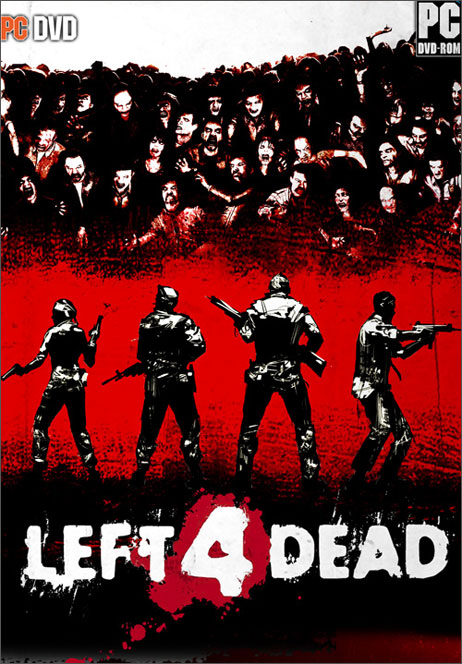
On the minus side, giving four characters equal space made them all quite small, wasting a lot of valuable box real estate without doing the one thing good box art is supposed to do: catch the eye.
Magnifying the problem was the fact that there wasn't much point to having our four heroes standing around in a void. To give the box art any sort of context to the game inside, we needed zombies. So we were faced with the unpopular idea of shrinking our heroes down even more to cram some zombies into the picture:
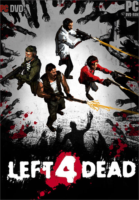
These attempts did a good job of capturing the multiplayer aspect of L4D, not to mention the intensity of the gameplay experience. But when viewed from a distance—by someone walking through a game store and spotting it on a shelf, for instance—it just looked like cluttered noise. The individual elements were too small and varied to communicate anything visually interesting.
Box art featuring the title of the game as the prominent feature ended up in the same category. The idea behind this typographic approach was that if the characters had to be small, we should make sure the game's title was as prominent as possible:
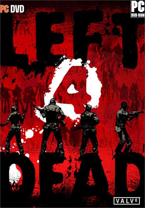
Unfortunately, this ran up against the same problems. Box art that's all text doesn't grab the eye, no matter how stylishly it's laid out. More importantly, it didn't feel like it was in the right "world"—put simply, it just didn't look like a game box.
After a visit to a local GameStop, it didn't take us long to realize the black, red and white color palette wasn't helping us much either. Red on black is a very attention-grabbing color scheme, and this fact wasn't lost on our competition. Scanning the shelves, we noticed a large number of game boxes already using similar color schemes in an attempt to draw the eye. But the effect, ironically, when viewed from a step back, was the opposite of the one intended—it was overwhelming.
That meant red was out now, too. Experiments with different colors, as well as research into classic zombie posters, eventually led us to green, which wasn't getting used a lot, and moreover suggested something rotting and gangrenous. This seemed perfectly in line with the "zombie panic" messaging we were hoping to get across.
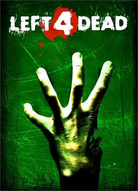
We had further success once got away from the clutter of our various "Survivors vs. Zombies" attempts, focusing on the simple idea of selling the idea of "four" itself in an iconic, visually compelling way. At some point the idea sprung up of a hand—its thumb chewed off by zombies, with only four fingers left—and it stuck.
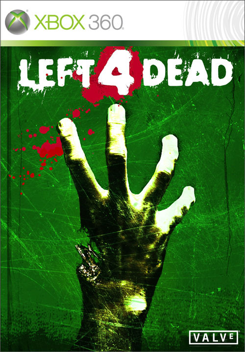
All of the noise instantly evaporated. Suddenly we had this horrific, easily graspable image, visible from far away, that managed to get across the core concepts of the game all in one go: Zombies. Four. Danger.
We had a cover we were happy with. Now it was time to put it to the test. The same local-area GameStop kindly let us conduct a few impromptu tests, printing out some of the above samples onto game boxes and placing them in various strategic positions. Then we simply hung out in the store for an afternoon, watching customers, and seeing which of the boxes grabbed people's eyes. Our instincts were on the money: The green hand art won hands-down.
But as it turned out, it still wasn't perfect—the final piece of the puzzle would actually arrive from a helpful fan. We had by this point shown off the new branding at E3, and it had only taken one fan about three seconds to point out that if we used a four-fingered left hand instead of a right hand, we could get a nice pun, with all three words of the game's title presented visually.
Happy to admit our mistake if it meant making it better, the game box was again retooled, arriving at the design on the box you see today: