


26470 In-game now on Steam

L4D Art Direction, Part 1: Filmic Effects
November 10, 2008 - Randy Lundeen
One of the goals of Left 4 Dead's art direction was to capture the tone and feel of being right in the middle of a horror movie. This meant making the environments look scary in a specifically cinematic way. To achieve this, we adopted four distinct "filmic" effects for our art direction: color correction, film grain, vignette and local contrast. We'll walk you through all four techniques, with examples, below.
If you wish to watch this video, you will need to Download the Flash plugin.
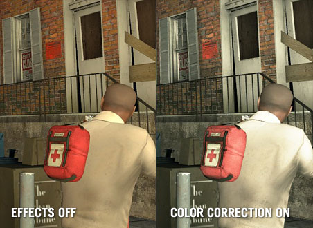
Color Correction
Color correction helps simplify the game's color palette without sacrificing utility. In other words, we drained the color out of certain areas of the environment to get a stark, moody tone, but made sure eye-catching and gameplay-specific elements (like health packs, blood and exit points) still popped onscreen:
Film Grain
Left 4 Dead is more frightening in a dark and shadowy environment. We found that applying a film grain technique heightened this feeling, both in helping to make the cinematic experience as gritty and authentic as possible, and in how effectively it implies a greater detail to the surrounding darkness than is actually there.
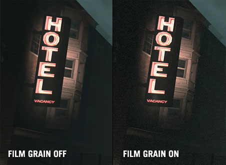
Thanks to playtesting, we also found that if we applied the film grain effect uniformly, people got tired of it fast. So we tweaked the technique. Consequently, in very dark areas with a lot of shadows, there's a lot of film grain visible. But the brighter an area gets, the more the grain fades into the background, and disappears entirely in very bright areas.
Vignette
A third film effect we experimented with was vignetting. This is a lens artifact you'll often see in lower budget films where cheap cameras were used: specifically, dark edges seeping in around the edges of the screen.
Even still, there's such a thing as too much. As you can see, we only applied the effect around all of the top edges of the screen, so a player wouldn't feel like they were looking through a telescope.

A little goes a long way — as it appears in the game now, playtesters didn't feel like it intruded at all. It also did a good job of softening the top edges, focusing the gameplay downwards to the center of the screen, where you want a player to look.
Local Contrast
The final technique used in Left 4 Dead was local contrast. This is a technique borrowed from photo retouching, where the contrast is adjusted specifically on areas of an image that contain a high level of visual detail. This technique helped make the visuals sharper and more focused.

This ended up being great shorthand for us, as it effectively imitated the feeling of an adrenaline rush or near-death experience. The effect gives the player a sense of heightened perspective, and was a great subliminal way to let them know a zombie attack was coming.

Visual Cues to Gameplay
Left 4 Dead's AI Director means that every time you play it you get a unique experience. Zombie attacks, music cues and even the narrative are generated on the fly based on your health, ammo, and how you're playing. Essentially, the AI Director changes your game experience as you play.
Our approach to art direction followed the same path—we wanted to ensure a player got a visually unique experience every time he or she played, based on their performance. Using the four effects we explained above as a foundation, we were able to dynamically blend them to dramatically alter the tone in key areas of the game.
One example of this is the "third strike" — what we call in-game when a player has lost almost all of their health twice, and is on his or her last legs. We've increased the level of vignetting to simulate tunnel vision, maxed the color correction to suck the color from the shot, and used local contrast in an inverse manner to soften the edges.
If you wish to watch this video, you will need to Download the Flash plugin.
The accumulative effect of all these techniques is to make it look as if the player is bleeding out. This, again, is a great visual shorthand. When you see this in the game, you don't need to be told that you're pretty close to death.
Pain pills are another example of a visual cue. In the game, a player can give him or herself a temporary health boost that will slowly drain away over time. In this instance, we've maxed out the local contrast, taking what is usually a subtle technique to imply heightened senses, and making it temporarily overt:
If you wish to watch this video, you will need to Download the Flash plugin.
That's all the space we have for now. In Part 2, "Stylized Darkness," we'll talk about our approach to lighting the dark and murky world of Left 4 Dead, with a focus on playable, stylized dark — namely, finding a balance that gives a player the illusion of darkness without getting frustrating.